Logos
White Space
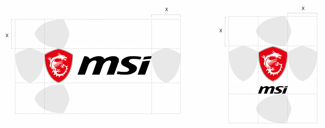
To achieve a visual effect and enhance recognition, it is must to have a “white space” to keep the MSI corporate logo separated from other visual elements (such as other logos, text, photos, or distracting patterns).
The minimum white space for horizontal and vertical MSI corporate logo is defined by the width of the shield
Once the logo is resized, it is a must to adjust the white space accordingly.
Color Plan
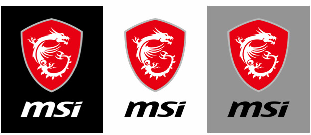
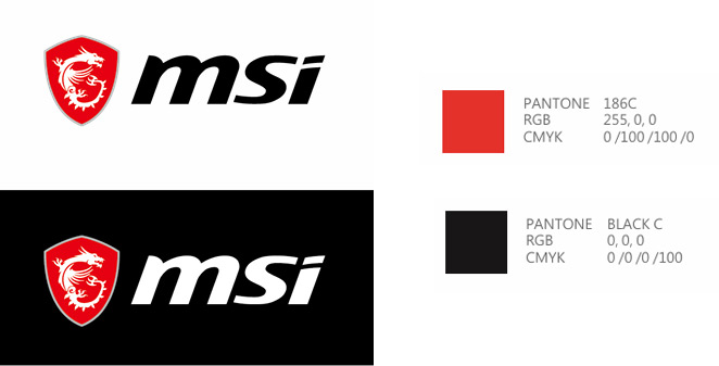
The application of the corporate logo must strictly follow approved color standards to ensure clear identification across different background colors, with Pantone, RGB, and CMYK specifications provided to maintain consistency across all media.
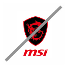
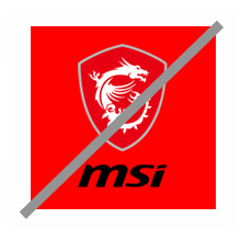
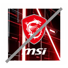
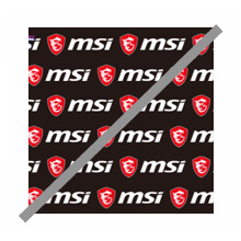
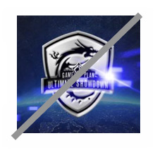
Incorrect Examples


